To help data scientists learn some of the basic concepts behind time series forecasting, I’m planning to write a series of brief posts on the topic, starting with autoregressive integrated moving-average (ARIMA) models, a classic technique used by economists for over a quarter century. I will be primarily focusing on intuition and common pitfalls, and will avoid most of the econometric theory behind time series forecasting (which is an expansive field).
Please note that all of the examples in this series will use the Python programming language and various libraries and packages. While most economists use closed-source, specialty stats packages like SAS, Eviews, and Stata to do time series forecasting, I’m focusing on Python because it is quickly becoming the dominant tool in data science and is preferred by many analysts over R, a very good alternative, open-source platform.
ARIMA models are an extension of autoregressive moving-average (ARMA) models, and can handle non-stationary time series, while ARMA models cannot. Briefly, stationary time series are well behaved, and have a finite and constant mean and variance over time. Such processes are mean reverting. By contrast, the variance of non-stationary time series are time varying and increase over time. Such processes tend to wander aimlessly (hence the name ‘drunkard’s walk’ or ‘random walk’) and can travel an arbitrarily far distance from their unconditional mean. As a rule of thumb, if a time series is highly persistent but follows no discernible pattern over time (like a stock price) or if a series trends away from its initial value without limit, that is a strong indication of a non-stationary series.
ARMA Models
Before jumping into ARIMA estimation, it’s helpful to define a basic ARMA(p,q) model, which is a combination of an autoregressive model of order p combined with a moving average model of order q:
Where in the above equation, y is the variable of interest (i.e., what we want to forecast) and ε is a period-specific random error term (i.e., noise). If the time series is non-stationary, then typically the coefficient on the first lag of y – i.e., β1 – is very close (or equal) to 1. In such a case, y is a long-memory process since any shock to y completely propagates forward to the next value of y. In other words, shocks are not dampened over time but persist. This is in sharp contrast to a stationary AR process, where shocks to y rapidly diminish, and in the absence of any additional shocks, the series converges to the long-run unconditional mean (E(y)).
If the variable of interest is non-stationary, then we say that it has a “unit root” and regular estimation techniques (OLS) will fail to produce unbiased estimates of our model parameters. To complicate matters, it is possible that our variable of interest is behaving like a non-stationary process but contains an exogenous trend component – i.e., the level of y increases by a fixed increment (δ) each time period:
In this case, one can simply add a trend term to an ARMA model and proceed with conventional estimation techniques (i.e., the series is “trend stationary”). Thus, there is a need to properly test for the presence of a unit root. For this task, we will use the augmented Dickey-Fuller (ADF) test.
ADF Test
An important result in time series statistics is that moving-average processes (i.e., MA(q)) can be “inverted” and represented as infinite autoregressive processes (AR(∞)). Therefore, an ARMA(p,q) can be practically represented by an AR(m), where m is finite but large enough to sufficiently capture the dynamics of the MA(q) process. Therefore, the ADF test frames both the null and alternative hypotheses in terms of an AR(m) processes, not an ARMA(p,q) process. Through some clever algebraic substitution, the null (H0) and alternative (HA) hypotheses can be expressed as follows:
Therefore, under the null hypothesis, the ADF test estimates the following regression equation:
where under our null hypothesis, a1 = 0 and β1 = 1. Since |β1| < 1 under the alternative hypothesis, the coefficient on yt-1 in the above regression must be weakly negative, since (β1 -1) = 0 under the null and (β1 – 1) < 0 under the alternative hypothesis. Therefore, the ADT performs a one-sided test on the coefficient (ρ) on yt-1:
Under the null hypothesis of a unit root, the simple t-statistic on rho used to perform the one-sided test does not follow a typical t-distribution, and therefore your stats package will produce and report the appropriate critical values for your test. Therefore, you cannot simply look-up the critical values for this test in a t-distribution table. Also, note that the null hypothesis is that there is a unit root. Thus, if we fail to reject the null hypothesis, then we confirm the presence of a unit root. You must reject the null hypothesis to conclude that you have a trend stationary process.
ARIMA Models
ARIMA models look very similar to ARMA models, with the proviso that the original series is non-stationary, and requires d first differences in order to remove any unit roots and make the series stationary. For example, if d=1, then a single first differencing of the data (which transforms the data from levels (yt) to period-over-period changes (Δyt)) is required. In this example, the “order of integration” is one, also written I(1). With this detail in mind, ARIMA models are characterized by three parameter choices – ARIMA(p,d,q). After taking the required differences (d) to make the time series stationary, estimation proceeds as it would for an ARMA(p,q) model, except that all variables are in differenced form:
ARIMA Forecasting Example: US Housing Prices
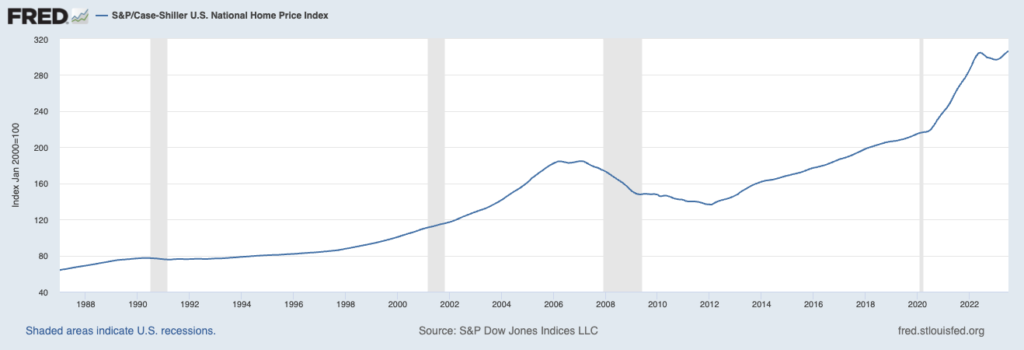
For this example, I’m going to forecast the S&P Case-Shiller US National Home Price Index through the end of 2023. To make my life easy, I will be using the seasonally adjusted series from the St. Louis Federal Reserve’s FRED II database. This is a monthly time series that runs from January 1987 to July 2023 as of the time of writing.
To perform this forecasting exercise, I used Python and various libraries and packages. I originally did this work in Jupyter-Notebook, and you can download that notebook and the data used in this exercise.
Step 1 – Load Packages and Dataset
# Import Packages
import warnings
import itertools
import pandas as pd
import numpy as np
import statsmodels.api as sm
import matplotlib.pyplot as plt
plt.style.use('fivethirtyeight')

# Load SA Case-Shiller US National Home Price Index
df_sa = pd.read_csv("CSUSHPISA.csv", parse_dates=["DATE"], index_col="DATE")
df_sa.rename(columns = {'CSUSHPISA':'home_price'}, inplace = True)

# Check for Missing Values
if (df_sa.isnull().values.any()):
    print('The df_sa data frame has missing observations')
else:
    print('The df_sa data frame has NO missing observations')
Step 2 – Perform ADF Test
# Create custom function to perform augmented Dickey-Fuller test
from statsmodels.tsa.stattools import adfuller

def run_adftest(ts):

    augmented_df_result = adfuller(ts)
    adf_stat = augmented_df_result[0]
    adf_pvalue = augmented_df_result[1]

    # Report Results
    print('The Augmented Dickey Fuller Test Statistic is: %f' % adf_stat)
    print('with a p-value of: %f' % adf_pvalue)
    if (adf_pvalue <= 0.05):
        print('therefore, we reject the null hypothesis of a unit root')
    else:
        print('therefore, we CANNOT reject the null hypothesis of a unit root')

    return None

adf_result = run_adftest(df_sa.home_price)
The test returns the following results:
The Augmented Dickey Fuller Test Statistic is: 1.028806
with a p-value of: 0.994561
therefore, we CANNOT reject the null hypothesis of a unit root
Given the strong long-run upward trend in US home prices, it isn’t surprising that the home price series is non-stationary. Before proceeding, it is a good idea to look at a plot of the first-differenced series.
# Plot the first difference of the home price index
d_home_price.plot(figsize=(15, 7))
plt.show()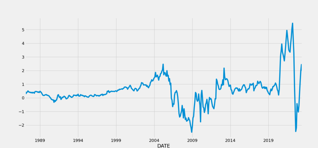
Interestingly, this series still doesn’t look anything like random noise, but instead is highly persistent. For example, from about 1991 to about 2005, the pace of month-over-month changes in home prices increased steadily. This reflects the growing bubble in real estate prices that eventually reversed ahead of the financial crisis and Great Recession of 2008-09. From 2009 to 2014, there is a very volatile but nonetheless upward trend in month-over-month price changes, with stable appreciation from 2014 to 2020, followed by arguably the emergence of another real estate bubble in response to COVID-related home buying. This pattern of hot and cold cycles in the housing market may be a sign that the first differenced series still contains a unit root.
Short of another ADF test, we can plot the autocorrelation function (ACF) and the partial autocorrelation (PACF). The ACF displays the raw correlation between values of our series (Δyt) and lagged values of itself – e.g., corr(Δyt,Δyt-5). For stationary time series, the lagged correlations should decay very quickly and only a few should be statistically significant (i.e., bars above the shaded region). For non-stationary series, the ACF tends to decay very slowly and a large number of lags are statistically significant.
The PACF displays correlations between values of our series (Δyt) and lagged values of itself while holding the contributions of the intermediary periods fixed. For example, the PACF between our series (Δyt) and itself lagged 5 periods (Δyt-5) holds the resulting variation in Δyt-4, Δyt-3, Δyt-2, and Δyt-1 fixed. Thus in this example, the PACF reveals the direct impact of shocks five periods in the past on the present value, while holding any transmission of the shock through the subsequent lagged values fixed. Past shocks typically have a ripple effect like a stone hitting a calm lake, causing a wave to propagate through time and space. In this analogy, the variation in the surface of the water five feet from the impact of the stone depends on the wave that travels outward from that point of impact, disturbing the surface one, two, three, four, and finally five feet outward. With the PACF, we are explicitly ruling this ripple effect out, and are trying to isolate the direct impact of a shock on a future value of the series. In a stationary AR(p) time series, the PACF contains (p) statistically significant bars, but they should each be well below 1.0 in value. For a series with a unit root, the value of the PACF corresponding to the first lag is typically very close to 1.0 and all of the subsequent bars are very low and statistically insignificant.
To plot both the ACF and PACF, run the following Python code:
# Plot the First difference and the ACF and PACF

from statsmodels.graphics.tsaplots import plot_acf, plot_pacf

fig, axes = plt.subplots(nrows=2, ncols=1, figsize=(6,8))
ax1, ax2 = axes.flatten()
plot_acf(d_home_price, ax=ax1)
plot_pacf(d_home_price, ax=ax2)
plt.savefig('acf_and_pacf_d1.png')
plt.show()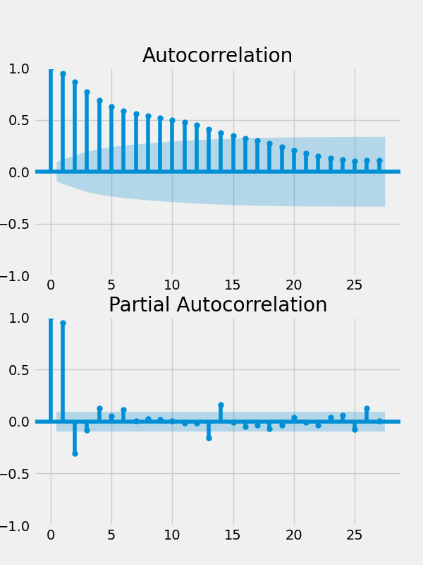
Given the clear evidence that a unit root is present in the first differenced time series, we rerun the ADF test on this series.
# Run the ADF Test of the 1st Differenced Data
adf_result = run_adftest(d_home_price)
The results confirm our suspicion:
The Augmented Dickey Fuller Test Statistic is: -2.703482
with a p-value of: 0.073438
therefore, we CANNOT reject the null hypothesis of a unit root
Now, let’s plot the second differenced series along with the corresponding ACF and PACF functions. The second differenced series looks a lot more like random noise, and the ACF and PACF plots look clean.
# Now, we will second difference the SA Home Price Series
d2_home_price = d_home_price.diff().dropna()

# Plot the Second difference and the ACF and PACF
fig, axes = plt.subplots(nrows=3, ncols=1, figsize=(10,12))
ax1, ax2, ax3 = axes.flatten()
ax1.plot(d2_home_price)
plot_acf(d2_home_price, ax=ax2)
plot_pacf(d2_home_price, ax=ax3)
plt.savefig('acf_and_pacf_d2.png')
plt.show()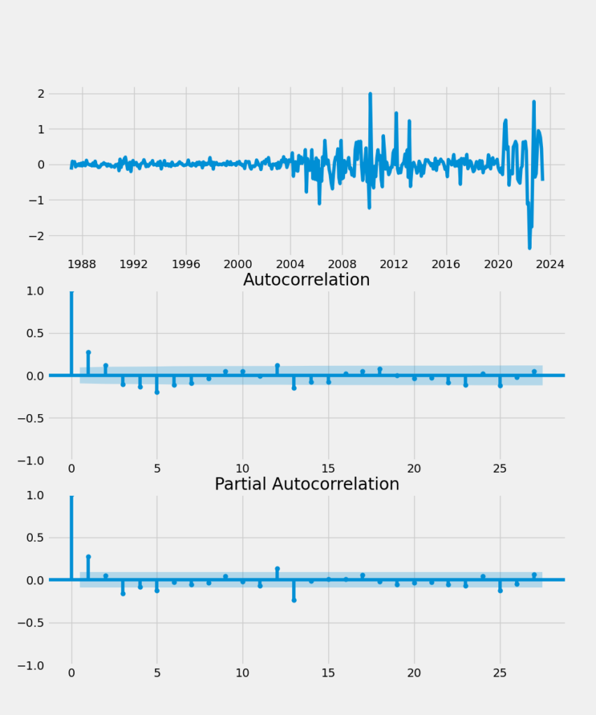
To formally verify that the second difference of the home price series doesn’t contain a unit root, we re-run the ADF test:
# Run the ADF Test of the 2nd Differenced Data
adf_result = run_adftest(d2_home_price)
The test results verify our hypothesis:
The Augmented Dickey Fuller Test Statistic is: -7.251626
with a p-value of: 0.000000
therefore, we reject the null hypothesis of a unit root
Step 3 – ARIMA Forecasting
We will withhold the last five years of data (60 monthly observations) to evaluate the performance of our various, estimated ARIMA models. This is conceptually the same concept of a testing dataset (from a train/test split) in data science parlance, but is commonly referred to as a “hold back” in econometrics.
# Train/Test Split (hold back the last 5 years = 60 monthly obs.)

home_price = df_sa.home_price

hp_train = home_price[:(len(home_price)-60)]
hp_test = home_price[(len(home_price)-60):]
To compare the accuracy of our estimated/trained models over the testing/hold-back dataset, we will introduce two complementary metrics, mean absolute percentage error (MAPE) and root mean squared error (RMSE):
# Evaluate Forecast Accuracy: MAPE and RMSE

def forecast_mape(actual,forecast):
    abs_norm_resid = np.abs((forecast - actual)/actual)
    mape = np.mean(abs_norm_resid)
    return 100*mape

def forecast_rmse(actual,forecast):
    mean_sq_resid = np.mean((forecast - actual)**2)
    return mean_sq_resid**(0.5)
Now, we will perform a grid search over the space formed by our model parameters (p x d x q) for the best performing ARIMA model using the Akaike Information Criterion (AIC) and the Bayesian Information Criterion (BIC) to guide model selection. There is strong evidence that the home price series is I(2), but there is a risk of over-differencing our model and degrading forecasting performance. Therefore, we will consider a wide range of both (possibly) weakly stationary I(1) and stationary I(2) forecasting models and see which has the best performance as measured by the AIC and BIC.
# Grid Search for best performing ARIMA model
from statsmodels.tsa.arima.model import ARIMA

warnings.filterwarnings("ignore") # specify to ignore warning messages

# Define the p, d and q parameters to take non-negative integer values
p = range(1, 4) # AR term goes back 1 and 3 quarters
d = range(1, 3) # Order of integration is either 1 or 2
q = range(0, 4) # MA term goes back 0 to 3 quarters

# Generate all different combinations of p, q and q triplets (take Cartesian Product = p x d x q)
pdq = list(itertools.product(p, d, q))

model_parameters_and_performance = []

for param in pdq:

    try:
        model = ARIMA(hp_train, order=param)
        results = model.fit()
        results_aic = results.aic
        results_bic = results.bic

        # Forecast 60 months ahead
        forecast = results.forecast(60)
        precision = forecast_mape(hp_test,forecast)
        fcast_rmse = forecast_rmse(hp_test,forecast)

        next_row = (param[0], param[1], param[2], results_aic, results_bic, precision, fcast_rmse)

        model_parameters_and_performance.append(next_row)

    except:
        continue
Before proceeding, let’s look at the RMSE of the various models over the forecast period. Specifically, lets do a side-by-side comparison of the I(1) and I(2) models with matching p and q parameters:
# Comparing RMSE Forecasting Performance in the I(1) vs I(2) ARIMA Models
model_df = pd.DataFrame(model_parameters_and_performance, columns=['p','d','q','aic','bic','forecast_mape','forecast_rmse'])
plt.figure(figsize=(12,5), dpi=100)
# I(1) models in Blue and I(2) models in Red
plt.plot(model_df.loc[(model_df.d == 1)]['forecast_rmse'].reset_index(drop=True), color='blue')
plt.plot(model_df.loc[(model_df.d == 2)]['forecast_rmse'].reset_index(drop=True), color='red')
plt.title('RMSE for I(1) vs I(2) Models')
plt.xlabel('Models')
plt.ylabel('RMSE')
plt.show()
Which produces the following plot:
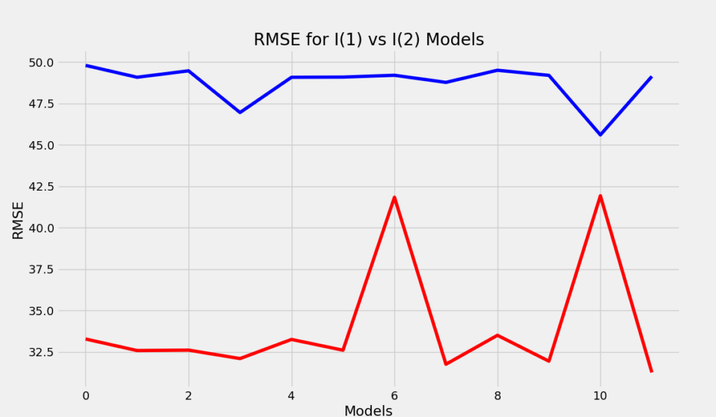
Clearly, the I(2) ARIMA models (red) have better forecasting performance across-the-board compared to I(1) models with the same (p,q) parameters. Therefore, I will focus my attention on just the I(2) models.
# Filter dataframe where the parameter d = 2
model_df.loc[(model_df.d == 2)]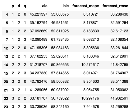
The AIC model selection criterion selects the ARIMA(3,2,3) model while the BIC selects the ARIMA(1,2,1). Given that the BIC criterion tends to select more parsimonious models than the AIC, this isn’t surprising. Moreover, the out-of-sample performance of both of these models is also comparable, which reduces fears that the bigger model is overfitting the data. While the conventional wisdom in this situation is to select the simplest model (ARIMA(1,2,1)), the downside is that the short lag length may be insufficient to capture more complex dynamics in the series, such as turning points/inflections, which a multi-period model could potentially detect. In this case, the predictions of both models are nearly identical over the 60-month holdback period:
# ARIMA(1,2,1) Forecast From July 2018 to June 2023
model1 = ARIMA(hp_train, order=(1,2,1))
results1 = model1.fit()
forecast1 = results1.forecast(60)

# ARIMA(3,2,3) Forecast From July 2018 to June 2023
model2 = ARIMA(hp_train, order=(3,2,3))
results2 = model2.fit()
forecast2 = results2.forecast(60)

# Confidence Intervals Model 1
forecast_and_ci1 = results1.get_forecast(60, alpha=0.05)
confidence_intervals1 = forecast_and_ci1.conf_int()

# Confidence Intervals Model 2
forecast_and_ci2 = results2.get_forecast(60, alpha=0.05)
confidence_intervals2 = forecast_and_ci2.conf_int()

# Plot Forecast over Holdback (Test) Period
plt.figure(figsize=(12,5), dpi=100)
plt.plot(hp_test, color='black', linewidth=3)
plt.plot(forecast1, color='blue', linestyle='dashed', linewidth=2)
plt.plot(forecast2, color='green', linestyle='dashed', linewidth=2)
plt.fill_between(confidence_intervals1['lower home_price'].index, confidence_intervals1['lower home_price'], confidence_intervals1['upper home_price'], color='k', alpha=0.15)
plt.ylabel('Home Price Index')
plt.title('Forecast from July 2018 to June 2023')
plt.show()
The solid black line is the actual home price series, the dashed blue line is the ARIMA(1,2,1) forecast, and the dashed green line is the ARIMA(3,2,3) forecast:
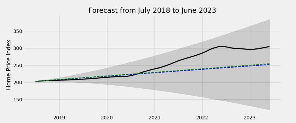
Finally, let’s forecast national home prices over the second half of 2023. I’ve plotted the forecasts of both models and their respective shaded confidence regions. Given the growing consensus that the housing market is losing steam as of the time of writing (October 2023), the ARIMA(3,2,3) model appears to produce a more plausible price forecast (dashed green line):
# Forecast Home Prices Over Q3 and Q4 2023

# ARIMA(1,2,1)
# Use entire sample to estimate/train model
model1 = ARIMA(home_price, order=(1,2,1))
results1 = model1.fit()
forecast_and_ci1 = results1.get_forecast(6, alpha=0.05)
confidence_intervals1 = forecast_and_ci1.conf_int()
forecast1 = results1.forecast(6)

# ARIMA(3,2,3)
# Use entire sample to estimate/train model
model2 = ARIMA(home_price, order=(3,2,3))
results2 = model2.fit()
forecast_and_ci2 = results2.get_forecast(6, alpha=0.05)
confidence_intervals2 = forecast_and_ci2.conf_int()
forecast2 = results2.forecast(6)

# Plot Forecasts
plt.figure(figsize=(12,5), dpi=100)
plt.plot(home_price[(len(home_price)-12):], color='black', linewidth=3)
plt.plot(forecast1, color='blue', linestyle='dashed', linewidth=2)
plt.plot(forecast2, color='green', linestyle='dashed', linewidth=2)
plt.fill_between(confidence_intervals1['lower home_price'].index, confidence_intervals1['lower home_price'], confidence_intervals1['upper home_price'], color='k', alpha=0.15)
plt.fill_between(confidence_intervals2['lower home_price'].index, confidence_intervals2['lower home_price'], confidence_intervals2['upper home_price'], color='k', alpha=0.15)
plt.ylabel('Home Price Index')
plt.title('Forecast from July to December 2023')
plt.show()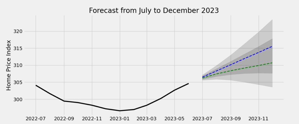
Closing Thoughts
Although most professional forecasters still prefer SAS, Stata, Eviews, and R (among other stats programs) to do forecasting, the growing popularity of Python in the data science community will likely change this over time. The purpose of this brief post is to show those interested in traditional univariate forecasting techniques how to perform a forecast in Python. In future posts, I plan to cover less orthodox forecasting methodologies that are growing in popularity among data scientists.
